Interior Design Myths + Mistakes and How to Fix Them
Have you ever spent hours browsing through interior design ideas on Pinterest, only to end up with a living room that looks more like a mishmash of trends than a cohesive sanctuary? The realm of interior design is filled with myths and common mistakes that can easily lead to frustration and disappointment. But don't worry, we're here to help. In this blog post, we'll debunk some of the most prevalent interior design myths and offer practical solutions to avoid common mistakes. Whether you're redesigning a single room or your entire home, these insights will guide you toward creating a space that truly reflects your style and needs. These tips are also helpful if you are staging your home to get it ready to sell.
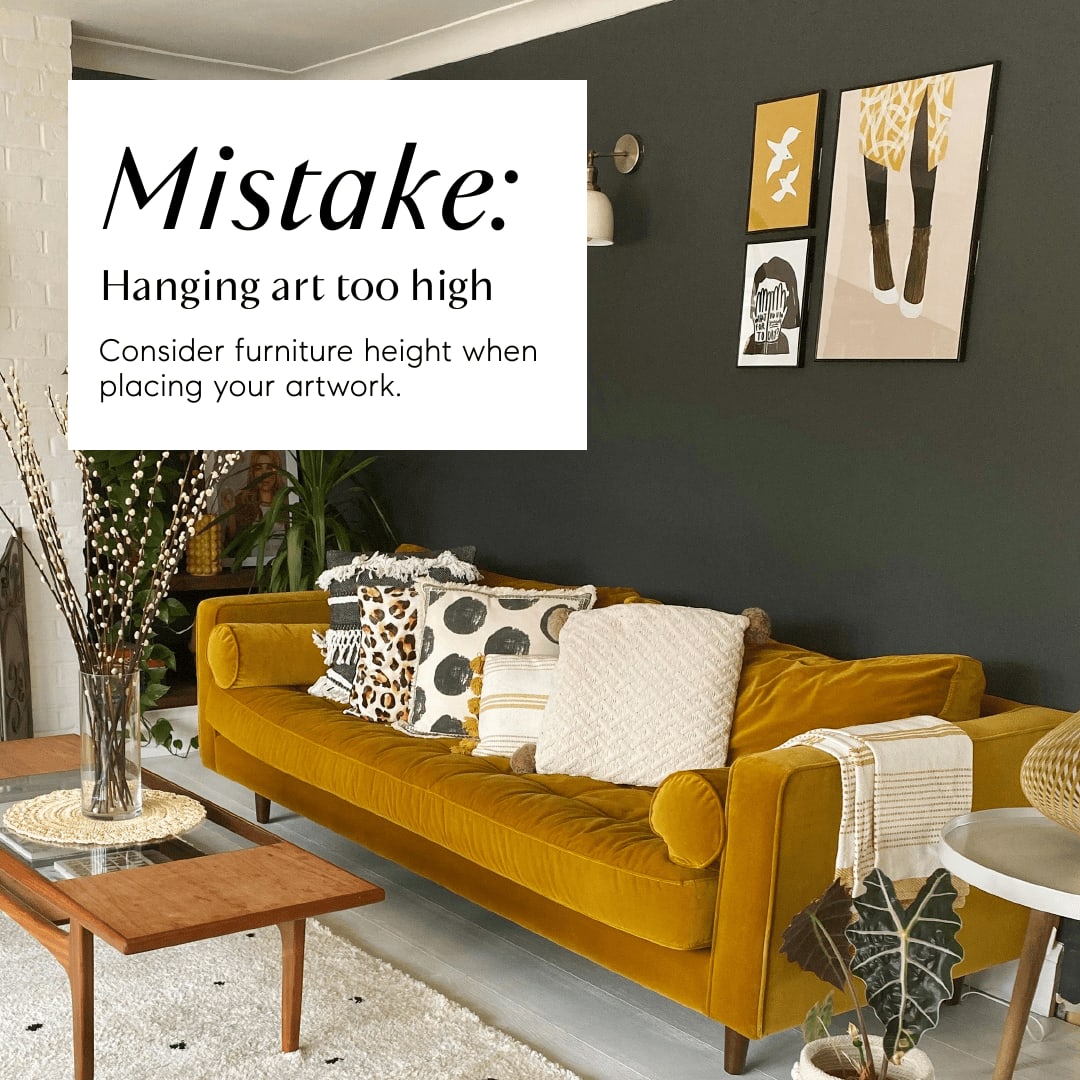
MISTAKE: Hanging art too high
TIP: When hanging art, think about the height of the surrounding furniture. The general rule is that art should be centered at eye level, but that can vary depending on the space. If you’re hanging artwork above a couch, console, or bed, place it so that the bottom of the piece is 6-12 inches above the furniture. This will create a visual connection between the artwork and the furniture, making the space feel more balanced and intentional.
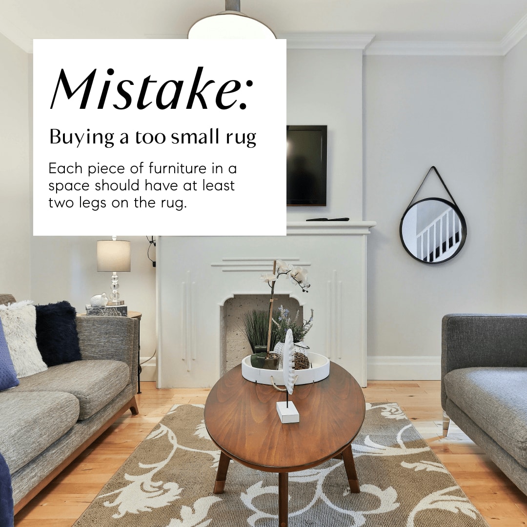
MISTAKE: Buying a too small rug
TIP: When selecting a rug, aim for one that’s large enough so that all the major furniture pieces in the room can have at least their front two legs resting on it. This simple guideline helps to tie the room together visually by creating a unified and grounded look. For example, in a living room, the front legs of your sofa, chairs, and coffee table should all sit on the rug. This ensures that the rug becomes a cohesive anchor for the furniture, establishing a well-proportioned and balanced space while adding warmth and texture.
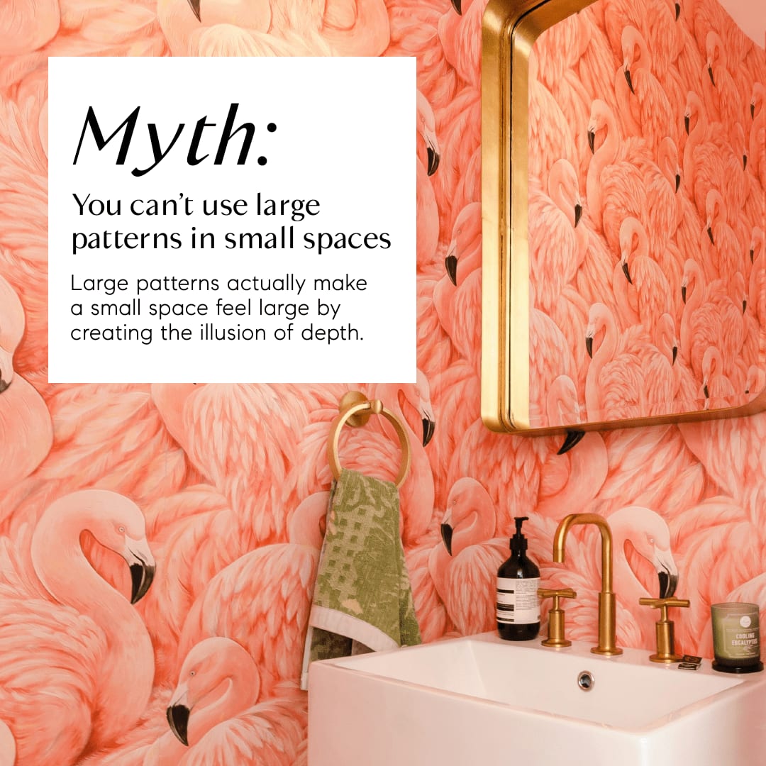
MYTH: You Can't use large patterns in small spaces
TIP: Contrary to popular belief, large patterns can be highly effective in small spaces. The bold shapes and expansive designs of large patterns draw the eye and create movement across the room, making it feel more dynamic and visually engaging. These patterns add a sense of depth and scale that tricks the eye into perceiving the space as larger than it really is. Whether used in wallpaper, rugs, or textiles, large patterns prevent the space from feeling cluttered or cramped, as their open, flowing design allows the room to feel more expansive and inviting. When used thoughtfully, they can also add character and personality, making the room feel both stylish and spacious.
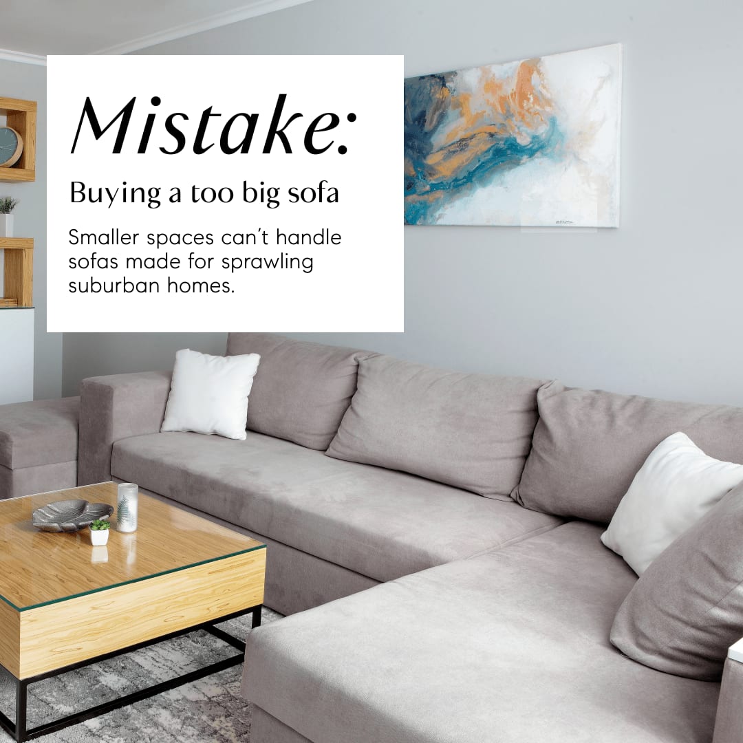
MISTAKE: Buying a too big sofa
TIP: In small spaces, oversized sofas can overwhelm the room, making it feel cramped and unbalanced. Large, bulky furniture limits movement and reduces the functionality of the space. Instead, opt for a smaller, more streamlined sofa that fits the proportions of the room. Compact sofas or sectionals with slimmer arms and lower backs will provide comfort without dominating the space, helping the room feel open and inviting while still functional.
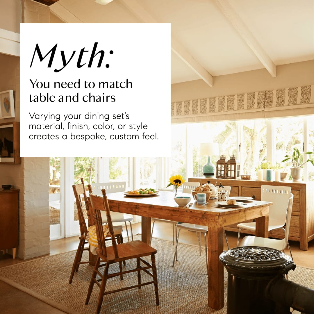
MYTH: You need to match table and chairs
TIP: Mixing and matching your dining table and chairs adds personality and visual interest to your space. Instead of a uniform look, combining different styles, finishes, or materials can make the dining area feel more dynamic and unique. For example, pairing a wooden table with upholstered or metal chairs introduces texture and contrast, making the space feel curated and intentional. This approach gives your dining room a custom, designer feel without being overly formal or predictable
Ready to transform your home? Contact us today to learn more about how we can help you prepare your home for a successful sale.
